
Display your work in a bold & confident manner. Sometimes it’s easy for your creativity to stand out from the crowd.
Where to find us
Phone: 657/4872-51475"

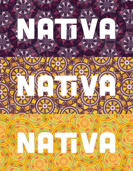
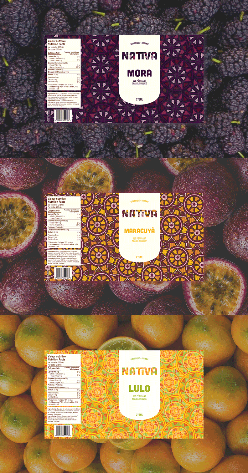
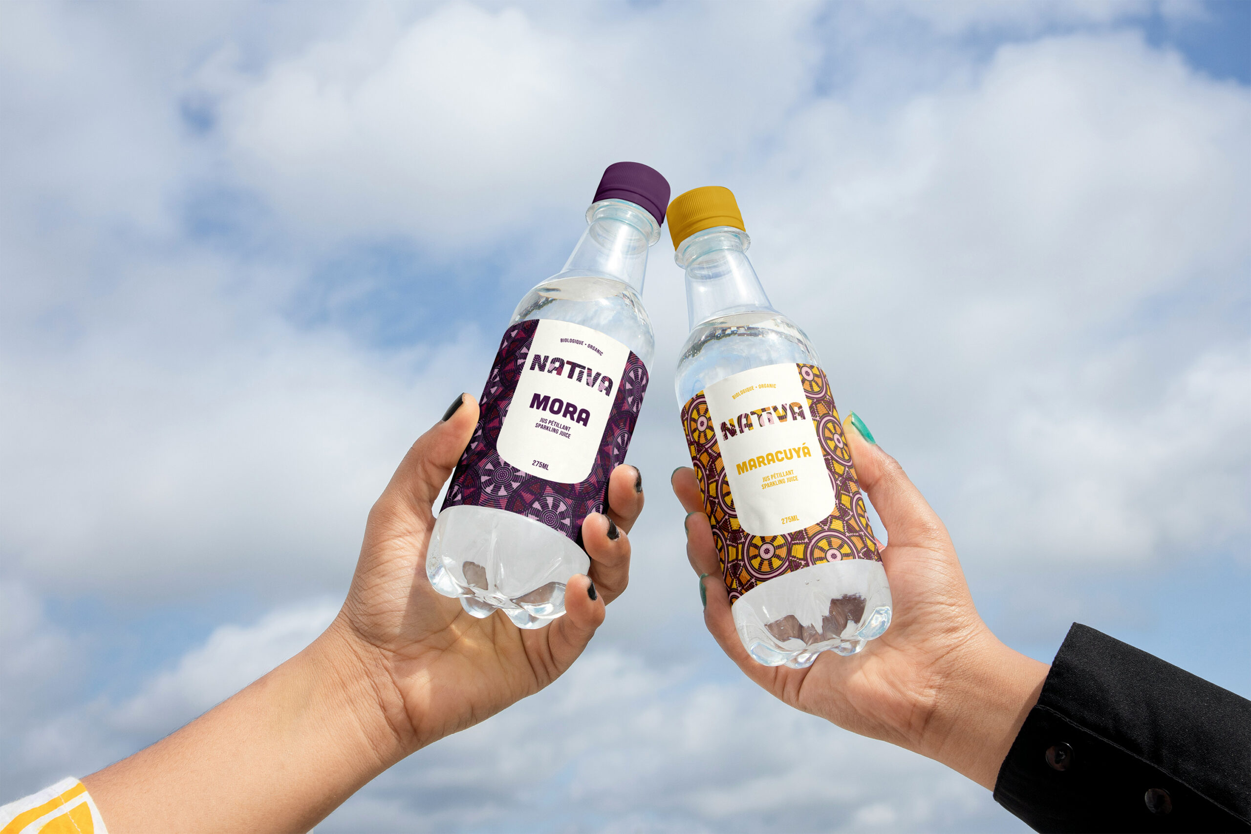
The goal was to create three labels for sparkling juice brand, each with its own distinct flavour identity while maintaining a cohesive look across the collection. The challenge was to create packaging that felt like part of the same family, yet allowed each flavour to stand out.
I wanted Nativa to carry a little piece of where I come from, so I drew inspiration from two things that remind me of home: the handmade mochilas of the Wayuu Indigenous community and the colourful houses found in towns like Guatapé and Salento. I was drawn to the rich textures and intricate patterns of the mochilas, alongside the vibrant colours that bring Colombian streets to life.
Together, these elements reflect the warmth and character of Colombia and became the starting point for Nativa's visual identity.
The name Nativa felt like the perfect fit. It brings together ideas of belonging, nature, and one's roots. To me, it reflects what makes Colombia so special: a diverse country filled with different regions, traditions, and cultures, yet connected by a shared love for home.
Every design choice was guided by one feeling: creating something welcoming, friendly, and nostalgic, while keeping a modern touch.
I chose sans-serif typefaces to keep the identity clean and approachable. The bold, thick logo gives the brand a strong presence, while the elongated typeface used for the body text adds a more sophisticated touch, balancing the playful shapes and colours.
The colour palette draws inspiration from the tropical fruits themselves, combining the shades found inside and outside each fruit with the vibrant colours of Colombian architecture.
Inspired by the circular patterns of Wayuu mochilas, I carried these shapes throughout the packaging. Beyond their visual appeal, circles represent togetherness: a circle of friends, a social circle, a community. This became a subtle way to express the connection and belonging at the heart of Nativa.
Type your paragraph here
Working on Nativa made me feel especially close to home. I wanted to create something that captured that familiar feeling of being reminded of a place, a memory, or a little piece of where you come from.
Sometimes, it's the smallest things that bring back the warmest memories. With Nativa, I wanted to capture that feeling and turn it into something people could hold.